


Chupa Chups Brand Book

by Polina
Artwork: Кириченко П.-Бараненко М. 11-Б
- Joined Dec 2023
- Published Books 1
Copyright © 2023
OUR HISTORY:
Chupa Chups is a confectionery company from Spain that is famous for its round candies. It appeared in 1958 when Enric Bernat bought out Granja Asturias, which produces apple jam. The idea to stick sweets on a stick came to him after watching the children. The businessman noticed that his main consumers were dissatisfied with ordinary sweets: their hands became sticky, because of which their parents often fought. Now the brand belongs to the Italian-Dutch corporation Perfetti Van Melle and offers more than a hundred varieties of candies.
Meaning and History
The prototype of the famous Chupa Chups logo appeared only in 1969. Before that, developers experimented with style, making the design understandable and attractive to the target audience.
What is Chupa Chups?
Chupa Chups is a Spanish brand owned by the Italian company Perfetti Van Melle. Its most famous product is a lollipop. Chewing gum, toys, and carbonated drinks are also sold under the Chupa Chups TM.
![]()
Font and Colors
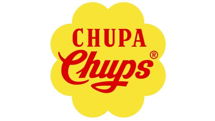
The modern Chupa Chups logo looks like a flower with eight rounded petals. This is Salvador Dali’s idea, although the general style differs markedly from that suggested by the Spanish painter. Designers have departed from restrained minimalism, added many small details, and arched lines. They also changed the inscription located in the center of the chamomile, making the words symmetrical.
The first advertising slogan, which was supposed to attract the attention of Spanish consumers, read: “Chupa Chups.” The ads became so viral that they decided to change the name of the sweets, and that is how they began to be called Chupa Chups. From that moment, sales began to grow and expand in countries close to Spain. The first slogan also included the following: és rodó i dura molt, Chupa Chups translated from Catalan means “it is round and lasts a long time.” One of the most important decisions was to replace the wooden stick with a plastic one, as this would be much cheaper. After some time, it was decided to make a new logo, and then Enrique turned to his friend and great artist, the famous surrealist Salvador Dali.
According to the popular version, it took the genius only an hour to create a logo, according to another source: the artist painted for hours in newspapers, which became the hallmark of Chup Chups. One way or another, Dali’s idea turned out to be extremely simple: place red letters on a yellow daisy flower. The rebranding of the logo was made only once, in 1988.
Until 1990, the logo was combined with two fonts: antique with short serifs and handwritten with curls. A modern trademark is not so varied in terms of typography. The phrase “Chupa Chups” is kept in the same style, and the “s,” which was previously printed, became handwritten.
To make the candy wrapper attractive and to interest the children’s audience, the designers used several colors. As the main ones – red and yellow, as additional ones – gray-green and white. The vibrant palette matches the chamomile shape, balancing the illusory simplicity of the emblem.
What is the Chupa Chups slogan?
The first slogan of the company, created by Enric Bernat in 1958, was the phrase in Catalan ‘És rodó i dura molt, Chupa Chups,’ which in English means ‘It’s round and long-lasting.’ The modern motto is more practical and socially significant, although not without a marketing background: ‘Stop smoking, start sucking!’. They are not used in the Chupa Chups logo and serve for promotional purposes.
Did Salvador Dali Make the Chupa Chup logo?
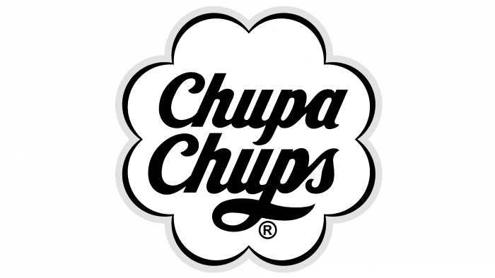
Yes, Salvador Dalí created the Chupa Chups logo, which was personally requested by Enric Bernat, the owner of the confectionery company. The artist’s version appeared in 1969 and is still in use today. It has the shape of a flower with improvised petals. In 1990, the designers slightly corrected the emblem, adding three arches along the edges – white, red, and bronze. Dalí also moved the symbol from the side of the wrapper to the center so that the title graphic was on top.
Published: Dec 7, 2023
Latest Revision: Dec 7, 2023
Ourboox Unique Identifier: OB-1524017
Copyright © 2023
![]()
