
We’ve all encountered 404 error code – page not found.
It can be very annoying, but if you are anything like me – you would probably just ignore it and do one of two things:

Go back to the previous page
or
retype your desired url and hope for the best….

There is a story about the origin of the number 404 for stating this specific HTTP error, going back to the early days of the internet. It is said that the two famous engineers, Tim Berners-Lee and Robert Cailiiau were working on a new network, that later would become “The Internet”. They worked in the CERN building in Geneva, on the fourth floor, in room no. 404.
Too bad it’s just an urban legend and they both denied this story…
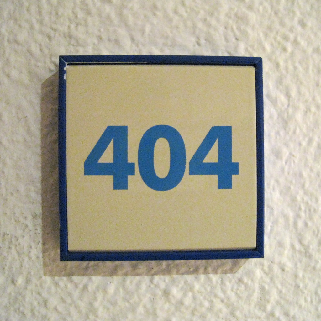
But 404 pages don’t have to be boring!
They can actually be much fun.
And if you own a website, they can even help you communicate with whoever is looking for something on your site, but got lost for a minute.

Lately I went over many 404 pages, looking for some inspiration for my own website.
I think I can sum up my insight about 404 pages by saying there are three different approaches to design this page, so it will do something for you and for your visitors.

#1: A polite “NO”
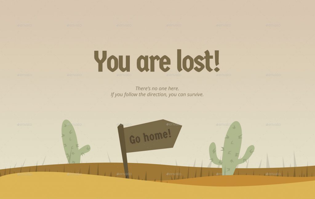
Website owners who choose this approach want to make sure you know you got lost, but they want to prevent you from feeling bad about it.
The text of such a page will calm you (“Oops” or “It can happen to anyone”, for example). It can even show a funny photo of a deserted island or a desert, so you’d know you should you are at the wrong place.
#2: Information Desk
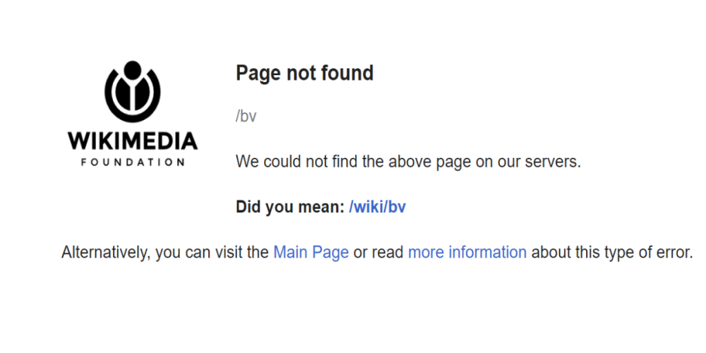
When this approach is taken, the 404 page will make sure you know you are lost, but it will present some alternatives and useful information:
- The website homepage
- The FAQ page
- A search bar
- Did you mean…?
- Contact info
- and so on
#3: Looking for opportunities
Well, since you are already lost, let’s try to make the best out of this situation.
This kind of pages show some potential value for the user and for the owners as well. This can be achieved either by choosing unique text or visual that conveys the website message, offering access to high-quality content you may find interesting or provoke engagement in a funny way
Here are some more examples of 404 pages.
Which one of them can be your inspiration?
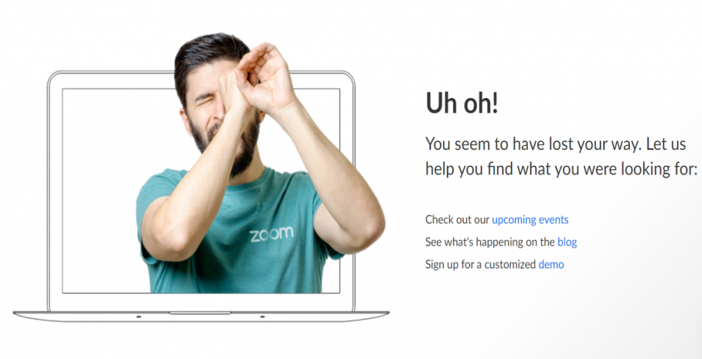
This one is what you get on the Zoom website
This one belongs to Youtube
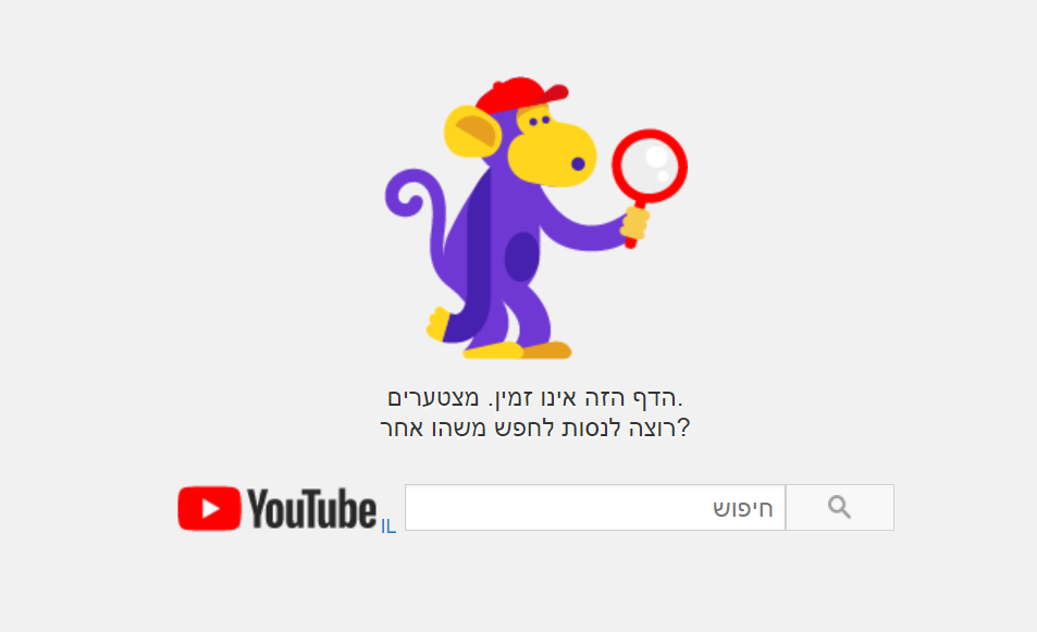
Google has this 404 page
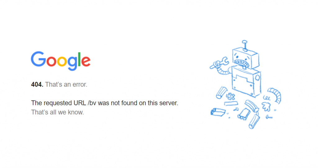
And this one belongs to Facebook. Pretty informative, right?
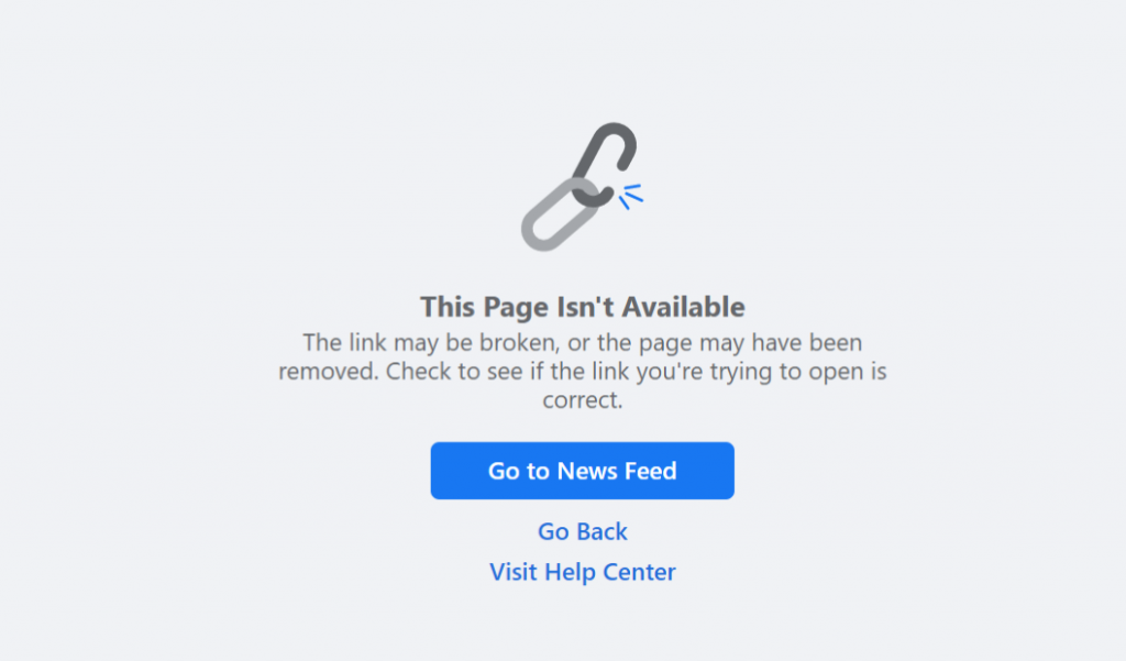
What do you say about Pixar’s?
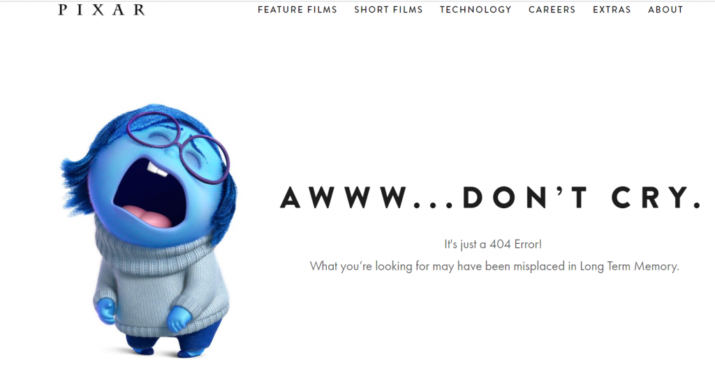
Did you come up with your own idea?
I would love to hear about it.
You can contact me on [email protected]
Published: Aug 15, 2021
Latest Revision: Aug 15, 2021
Ourboox Unique Identifier: OB-1194780
Copyright © 2021


